Think of a high-converting landing page as your digital sales representative who never sleeps, never takes a coffee break, and works around the clock to turn visitors into qualified leads. When you look at the numbers—the average landing page conversion rate across all industries sits at just 5.89%—you realize there's tremendous opportunity for businesses that truly master the art and science of landing page design.
Whether you're running paid advertising campaigns, email marketing initiatives, or organic traffic strategies, your landing page serves as that critical bridge between someone's initial interest and their actual conversion. Let's dive deep into the proven strategies, layouts, and psychological principles that separate the high-performing landing pages from those that hemorrhage potential leads.
Understanding the Foundation: What Makes Landing Pages Convert
Before we explore specific design techniques, it's essential to understand that successful landing pages operate on one fundamental principle: absolutely everything on the page must serve the singular goal of conversion. Unlike your website's homepage, which might juggle multiple objectives, a landing page stays laser-focused on one specific action—whether that's capturing email addresses, booking demos, or generating qualified leads.
The most effective landing pages I've seen follow a structured approach that incorporates these eleven critical elements:
First, there's creative brief alignment with campaign messaging—making sure what brought them there matches what they find. Then you need compelling copy that actually addresses visitor intent, not just what you want to say. The information architecture and visual hierarchy have to be clear—people shouldn't have to hunt for what matters.
You want a strategic attention ratio, ideally 1:1, meaning one action to take, not ten. Above-the-fold optimization is crucial for those first impressions. You need distinct visual assets that actually support your narrative, not just pretty pictures. Include contextual visual aids and product demonstrations that show, don't just tell. Every feature needs translation into a benefit they care about. Social proof validation builds trust. And finally, reinforcement messaging throughout the page keeps them moving toward conversion.
Proven Layout Strategies That Drive Conversions
The Psychology of Visual Scanning Patterns
Understanding how visitors actually consume information is crucial for effective layout design. Research consistently shows that users follow predictable scanning patterns—primarily the F-pattern and Z-pattern—and smart designers leverage these natural behaviors to guide attention exactly where it needs to go.
The F-Pattern Layout works beautifully for content-heavy pages. People naturally read across the top, then down the left side, occasionally scanning rightward. By placing your most critical information—your headline, value proposition, and primary CTA—along this natural left-to-right, top-to-bottom scanning path, you're working with human behavior, not against it. This pattern is particularly effective for B2B lead generation where prospects need more detailed information before they're ready to convert.
The Z-Pattern Layout, on the other hand, is perfect for simpler, more visual pages. It creates a natural flow from your headline in the top-left corner to navigation or secondary elements in the top-right, then diagonally down to supporting content in the bottom-left, and finally to your call-to-action in the bottom-right. It's like drawing an invisible path for the eyes to follow.
Single-Column vs. Multi-Column Design
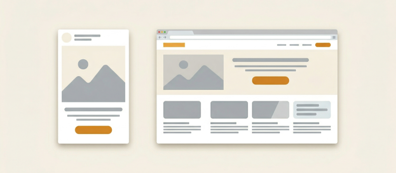
The data here is crystal clear: single-column layouts consistently outperform multi-column designs when it comes to conversion optimization. Why? Because this approach eliminates decision paralysis and creates a clear, linear path toward your conversion goal. There's no confusion about where to look or what to do next. Single-column layouts become particularly crucial for mobile optimization, where 53.3% of all website traffic now originates.
Strategic Above-the-Fold Optimization
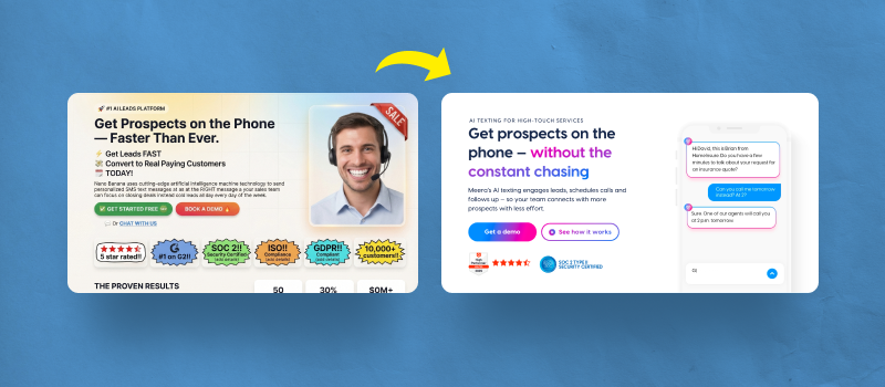
Your above-the-fold content—everything visible without any scrolling—carries the heaviest conversion burden on your entire page. This section must immediately answer three critical questions that every visitor has:
What exactly are you offering? You need a clear value proposition that leaves no room for confusion. Why should I care? Your benefit-focused messaging needs to hit home immediately. And what should I do next? That prominent call-to-action better be impossible to miss.
Research shows that placing lead capture forms above the fold can increase conversions by up to 94% compared to forms that require scrolling to reach. That's not a small improvement—that's transformative.
Copywriting Strategies That Convert

Headlines That Stop the Scroll
Here's a sobering fact: your headline gets read five times more often than your body copy. That makes it your most valuable real estate. High-converting headlines typically focus on one or more of these powerful elements:
Pain point agitation works by addressing specific problems your audience faces—the stuff that keeps them up at night. Solution promises clearly articulate the transformation you provide—where they'll be after working with you. Curiosity hooks use statistics, questions, or surprising statements that make people think "wait, what?"
Instead of generic, forgettable headlines like "Download Our E-book," try compelling alternatives that actually mean something. "Discover the Secrets to Doubling Your Sales" speaks to a specific outcome. "The 5-Minute Strategy That Increased Revenue by 127%" combines specificity with an impressive result.
Benefits Over Features: The Golden Rule
Here's what most people get wrong: visitors don't care about your product specifications—they care about outcomes that improve their situation. Every single feature you mention should immediately connect to a tangible benefit. Transform boring features like "24/7 customer support" into benefits that resonate: "Get answers to urgent questions anytime, even at midnight on weekends when everything's going wrong."
Creating Urgency Without Being Pushy
Effective urgency creation focuses on genuine scarcity and time-sensitivity, not fake pressure. Rather than those annoying fake countdown timers that everyone knows reset when you refresh the page, consider genuine urgency drivers that actually matter:
Limited availability that's real: "Only 50 spots remaining in this cohort—we cap it for quality." Time-sensitive bonuses that expire: "Free strategy session included for the first 100 sign-ups." Seasonal relevance that makes sense: "Get ready for Q4 planning season before it's too late."
The Power of Personalization
Here's a stat that should make you sit up: personalized CTAs convert 202% better than generic versions. But this doesn't just mean slapping the visitor's name on the button—it means tailoring your entire message to their specific traffic source, geographic location, or previous interactions with your brand. It's about making them feel like this page was created just for them.
Trust-Building Elements That Remove Friction

Social Proof That Actually Works
Not all social proof is created equal—generic testimonials are basically worthless. The most effective trust builders include several key elements:
Customer Testimonials need to feature specific, results-oriented quotes from real customers. Instead of useless fluff like "Great service!" you want testimonials like "This strategy helped us generate 47% more qualified leads in just 60 days - Sarah, Marketing Director at TechCorp." See the difference? Specificity sells.
Case Studies provide those detailed success stories with measurable outcomes. B2B buyers especially value seeing how others in similar situations achieved real results. They want to see themselves in these stories.
Usage Statistics should display concrete numbers like "Trusted by 15,000+ marketing professionals" or "Over 2 million campaigns optimized." Numbers create credibility.
Industry Recognition means showcasing relevant awards, certifications, or media mentions that establish your credibility. But only include ones that actually matter to your audience.
Trust Badges and Security Signals
Include relevant trust indicators that actually mean something to your visitors. SSL certificates and security badges show you take data protection seriously. Industry association memberships prove you're legitimate. Payment processor logos like PayPal or Stripe that people recognize build confidence. Privacy policy links show transparency. Money-back guarantees remove risk.
Transparent Contact Information
Nothing says "we're a real company" like displaying multiple ways for prospects to reach you. Include your physical business address—not just a PO box. Provide phone numbers with real people actually answering them. Offer live chat functionality with humans, not just bots. List email addresses that actually get responses, not black holes.
Mobile Optimization: The Non-Negotiable Priority

With mobile traffic dominating digital interactions, mobile optimization isn't optional anymore—it's essential for survival. If your landing page doesn't work flawlessly on mobile, you're basically turning away more than half your potential leads.
Mobile-First Design Principles
Simplified Navigation is crucial. Remove those complex menus and focus on essential actions only. Use sticky navigation so important elements stay accessible, and include clear "back to top" buttons for longer pages so people don't get lost.
Touch-Friendly CTAs mean designing buttons that are actually easy to tap with thumbs. Use contrasting colors that pop off the screen and generous spacing so people don't accidentally tap the wrong thing. There's nothing more frustrating than trying to tap a tiny button on a phone screen.
Compressed Content acknowledges that mobile users scan even more aggressively than desktop users. Use bullet points liberally, keep paragraphs short, and include visual breaks to improve readability. Make it easy to consume in small bites.
Speed Optimization is critical—53% of mobile visitors abandon pages that take longer than 3 seconds to load. That means optimizing images, minimizing code, and prioritizing above-the-fold content loading. Every second counts.
Mobile-Specific Features
Leverage what makes mobile special to reduce friction. "Call Now" buttons that instantly dial your number eliminate steps. Location-based personalization for local businesses makes content more relevant. GPS integration for directions to physical locations removes barriers.
Visual Hierarchy and Design Psychology
The 60-30-10 Color Rule
This interior design principle translates perfectly to landing pages. Use 60% of your design in a dominant background color, usually something neutral that doesn't fatigue the eyes. Apply 30% in a secondary color for headers, sections, and navigation elements. Reserve that final 10% for your accent color—this is for CTAs and important elements that need to pop.
Strategic Use of White Space
White space isn't empty space—it's one of your most powerful design tools. It focuses attention on critical elements by giving them room to breathe. It reduces cognitive load, making decisions feel easier. It creates visual breathing room that prevents that overwhelming feeling. And it guides eye movement through your conversion path like an invisible hand.
Color Psychology for Conversion
Different colors trigger distinct emotional responses, and you can use this to your advantage:
Blue builds trust and security—it's ideal for financial services, healthcare, and B2B software where trust is paramount. Green suggests growth, harmony, and "go ahead"—perfect for environmental products and positive CTAs. Orange creates energy and urgency without the alarm of red—effective for limited-time offers and action buttons. Red generates excitement and urgency but use it sparingly for high-impact CTAs or you'll exhaust people. Purple conveys luxury and creativity—great for premium products and innovative solutions.
Form Design: Converting Visitors Into Leads
Form Field Optimization
The Goldilocks Principle applies here: use exactly as many fields as you need for proper qualification, but not one more. Too few fields generate low-quality leads that waste your sales team's time. Too many fields reduce completion rates and scare people away.
Progressive Profiling is smart—start with essential fields like name and email, then gradually collect additional information through subsequent interactions. Don't ask for everything upfront.
Field Ordering Strategy matters more than you think. Begin with easy fields like name and email that people fill out without thinking, then progress to more complex questions. The sunk cost fallacy works in your favor—users are more likely to complete forms they've already started.
Multi-Step vs. Single-Step Forms
Multi-step forms consistently outperform single-step forms, and the reason is psychological—they appear less intimidating initially. That first step looks so easy! Use progress indicators to show completion status and maintain momentum. People like knowing how far they've come and how close they are to finishing.
Form Placement and Design
Above-the-fold placement ensures maximum visibility—don't make people hunt for your form. Single-column layout prevents confusion about what to fill out next. Clear field labels and helpful placeholder text guide users through the process. Inline validation catches errors immediately before frustration builds. Prominent submit buttons with action-oriented copy like "Get My Free Guide" beat generic "Submit" every time.
Advanced Conversion Optimization Techniques
A/B Testing Your Way to Success
Systematic testing removes all the guesswork from optimization decisions. But you need to focus on high-impact elements first:
Test Headlines with different value propositions, emotional appeals, and benefit statements. See what resonates with your specific audience. Experiment with CTAs—try different button colors, copy variations, sizes, and placements. Sometimes moving a button three inches changes everything. Compare Images—product shots vs. lifestyle imagery vs. human faces. Different audiences respond to different visuals. Test Forms by varying field quantities, trying multi-step vs. single-step, and experimenting with placement. Evaluate Social Proof by comparing different testimonial formats, placements, and quantities. Maybe three testimonials work better than ten.
Statistical Significance and Testing Duration
Here's what most people get wrong: most tests require several weeks to months to reach statistical significance. Avoid the temptation of ending tests prematurely or making decisions based on insufficient data. Use proper A/B testing calculators to determine appropriate sample sizes and testing durations. Patience pays off in accurate results.
Advanced Personalization Strategies
Beyond basic demographic personalization, consider these sophisticated approaches:
Traffic Source Personalization means showing different messages to paid search visitors vs. social media traffic. Someone from Google is in a different mindset than someone from Facebook. Geographic Customization lets you adapt messaging, currency, and offers by location. What works in New York might not work in Nashville. Behavioral Triggers customize content based on previous page visits or download history. If they've already downloaded your beginner's guide, show them advanced content. Time-Based Variations adjust messaging for different times of day or week. B2B visitors at 2 PM on Tuesday are different from those browsing at 10 PM on Sunday.
Measuring Success: Key Performance Indicators
Track these critical metrics to gauge landing page effectiveness:
Your Primary Metrics are the big ones. Conversion rate is most important—this is your north star metric. Cost per lead tells you if you're profitable. Lead quality scores determine if you're attracting the right people.
Secondary Metrics provide context. Bounce rate shows if people immediately leave. Time on page indicates engagement levels. Form abandonment rate reveals friction points. Mobile vs. desktop performance highlights platform-specific issues.
Qualitative Insights give you the "why" behind the numbers. User session recordings show exactly how people interact with your page. Heat map analysis reveals where attention goes. Form field drop-off points identify problematic questions. Customer feedback surveys provide direct insights into what's working and what isn't.
Implementation Roadmap: Your 90-Day Action Plan
Days 1-30: Foundation Building
Start by auditing existing landing pages for mobile responsiveness—this is non-negotiable. Implement basic trust signals like testimonials and security badges. Optimize above-the-fold content with clear value propositions that actually mean something. Set up proper analytics tracking for all conversion points so you know what's happening.
Days 31-60: Optimization and Testing
Launch your first A/B tests on headlines and CTAs—start with the highest-impact elements. Implement progressive form designs that don't scare people away. Add social proof elements throughout the conversion path, not just at the bottom. Optimize page loading speeds for mobile users—every second you shave off improves conversions.
Days 61-90: Advanced Tactics and Scale
Roll out personalization based on traffic sources—make each visitor feel special. Implement multi-step forms for complex lead qualification when you need more information. Add advanced trust elements like detailed case studies and usage statistics. Develop a systematic testing calendar for continuous improvement—this isn't a one-time project.
The Future of Landing Page Design
As technology evolves, several trends are shaping the future of lead generation, and you need to be ready:
AI-Powered Personalization means machine learning algorithms will deliver increasingly sophisticated real-time customization based on visitor behavior and preferences. Every visitor might see a slightly different page optimized just for them.
Voice Search Optimization becomes crucial as voice searches grow. Landing pages must be optimized for conversational queries and featured snippet placement. People ask Alexa differently than they type into Google.
Interactive Elements like calculators, quizzes, and interactive tools increase engagement while providing valuable lead qualification data. They're not just engaging—they're qualifying leads while entertaining them.
Video Integration continues to matter as short-form video content drives higher engagement rates and creates emotional connections with prospects. A well-placed video can do what a thousand words can't.
The Bottom Line
Mastering landing page design for lead generation requires combining art and science—understanding both human psychology and data-driven optimization principles. The most successful practitioners treat their landing pages as conversion laboratories, constantly testing hypotheses and refining based on real user behavior, not assumptions.
Remember that every industry, audience, and offer is unique. What works brilliantly for a B2B software company might completely fail for an e-commerce retailer. The key is establishing a rock-solid foundation of best practices, then systematically testing variations to discover what resonates most powerfully with your specific audience.
By implementing these strategies, layouts, and optimization techniques I've outlined in this guide, you'll transform your landing pages from simple lead capture mechanisms into powerful conversion engines that consistently deliver qualified prospects who are actually ready and excited to engage with your sales team.
The investment in mastering these skills pays dividends far beyond individual campaigns—it builds the foundation for scalable, predictable lead generation that fuels sustainable business growth. This isn't just about getting more leads. It's about building a system that works consistently, scales efficiently, and improves continuously over time.


