When a leading AI SMS platform needed a brand that could sell, design became the difference.
See the workFROM THE CLIENT
Pash has been our design partner for over four years and has done a fantastic job helping shape how our brand looks and feels across every channel. From the website to ads, trade show booths, and explainer videos, he's brought consistency to our brand as we've grown. He understands the business, anticipates what's needed, and delivers solid work we can count on.

I had the opportunity to work with Pash on a range of creative projects, and his work has truly elevated how our brand shows up across every channel. He brings a sharp eye for detail, executes flawlessly, and consistently delivers work that is both visually compelling and strategically aligned with our goals.

THE CHALLENGE
You've built something incredible. Invested years. Solved real problems. Your product works. But when buyers look at your website, attend your booth, or see your ads - they keep scrolling.
Their AI could automate 80% of sales conversations. Revolutionary technology. Proven results. Happy customers. But their brand?
Looked like every competitor
Failed to communicate value fast enough
Didn't convert traffic into pipeline
Left money on the table
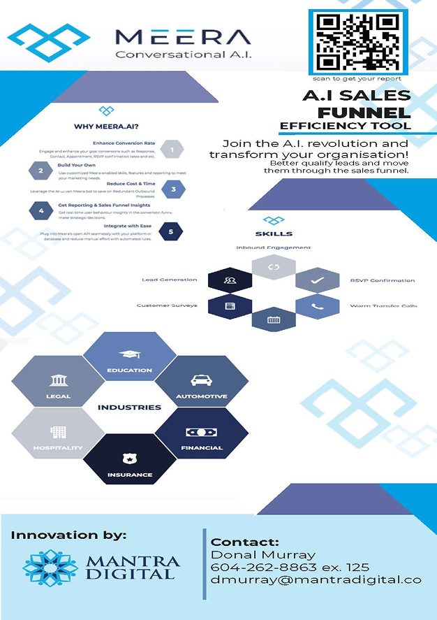
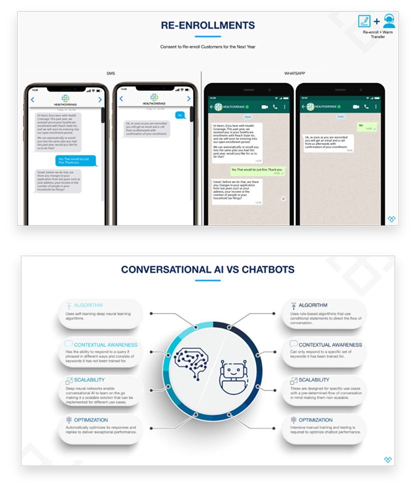
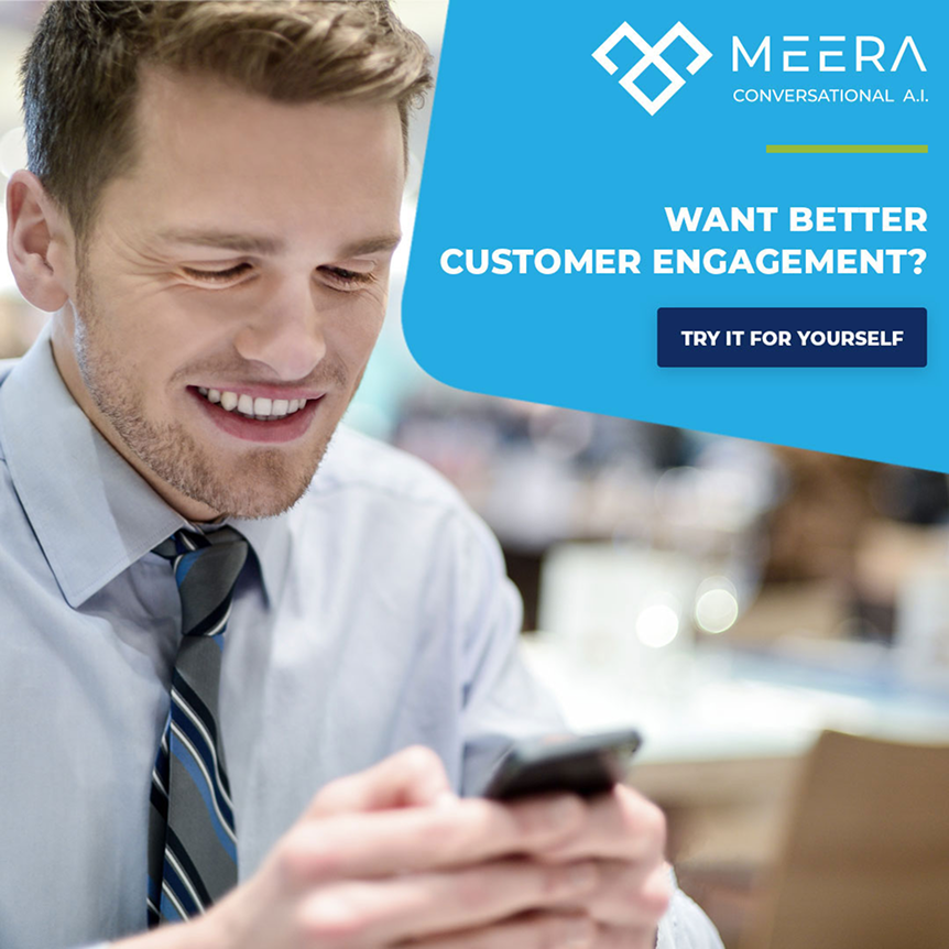
Some examples of where the brand was falling short:


In B2B, buyers don't choose the best product. They choose the one they trust fastest. If your brand can't sell your value in seconds, you've already lost.
THE WORK
Four years. 100+ assets. Every channel touched. These are two of them.
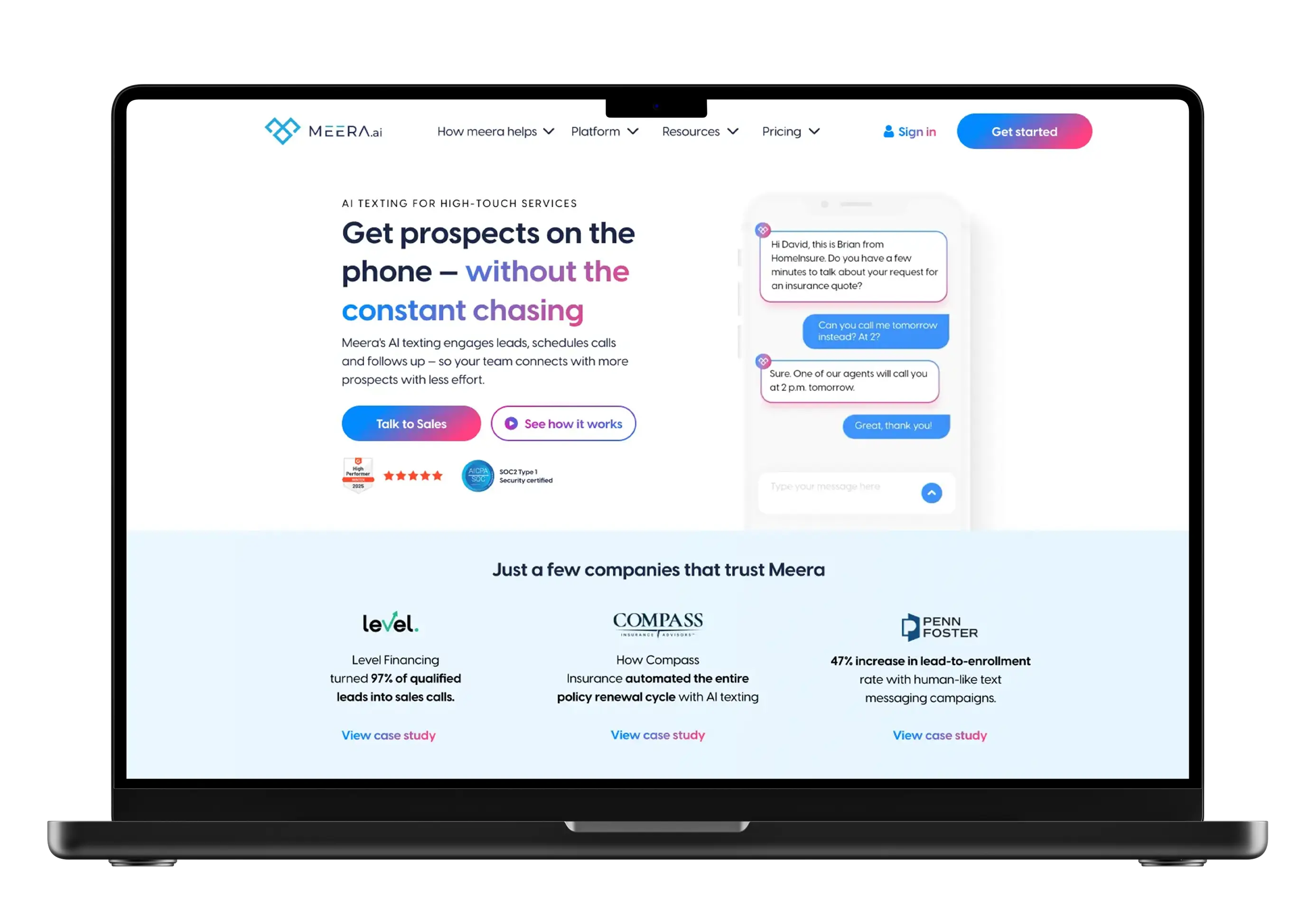
EXAMPLE 01 — THE WEBSITE
Built from zero - not a template, not a redesign. Every page, every section, every micro-interaction crafted to convert visitors into pipeline. This wasn't web design. This was growth architecture that became the backbone of their entire marketing engine.
See it live
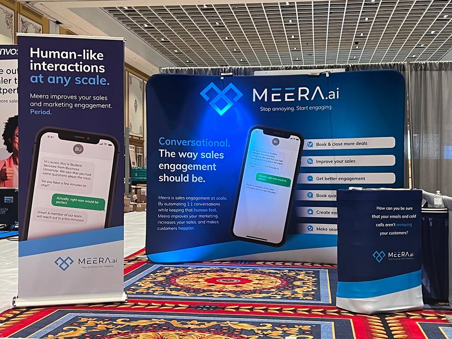
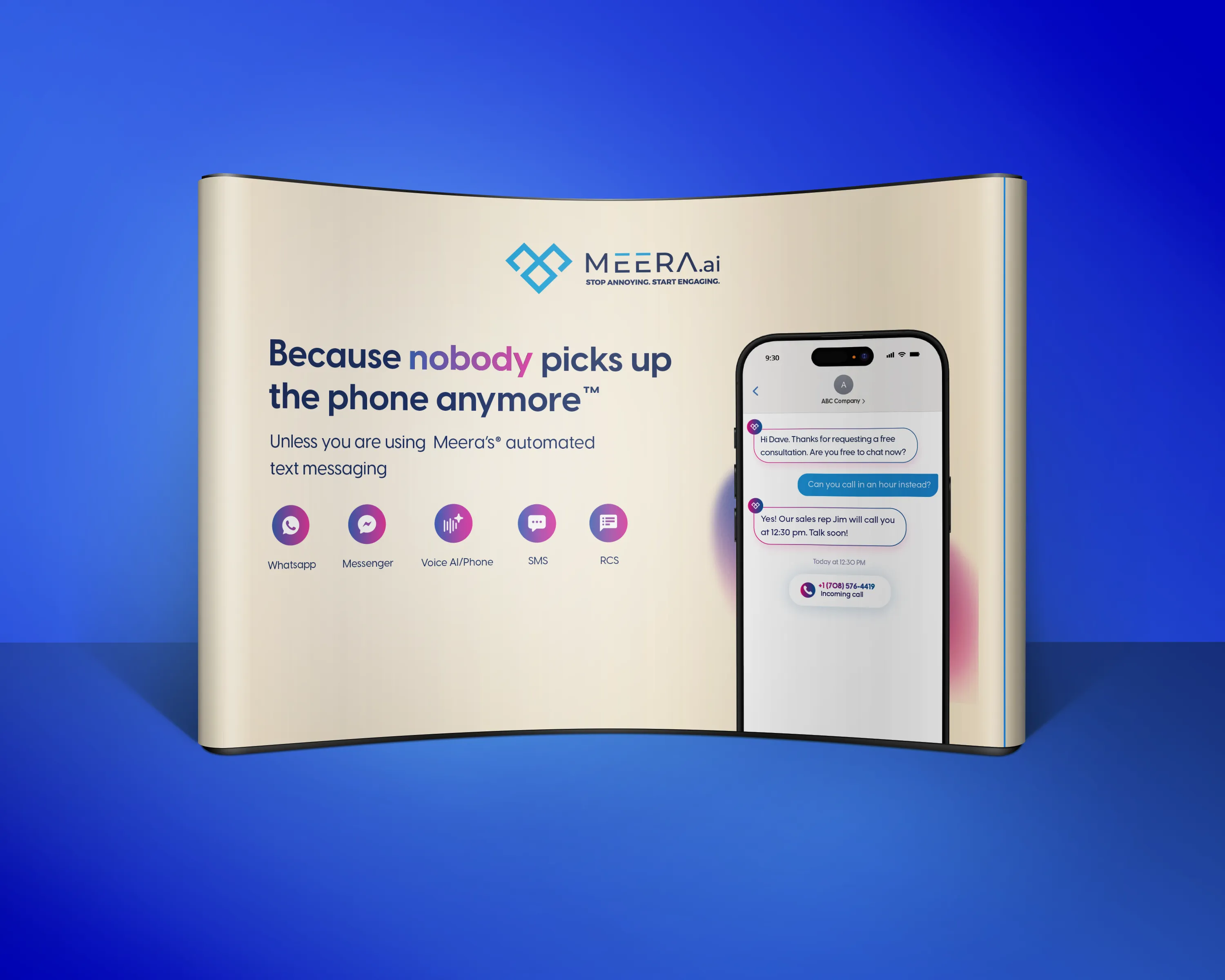
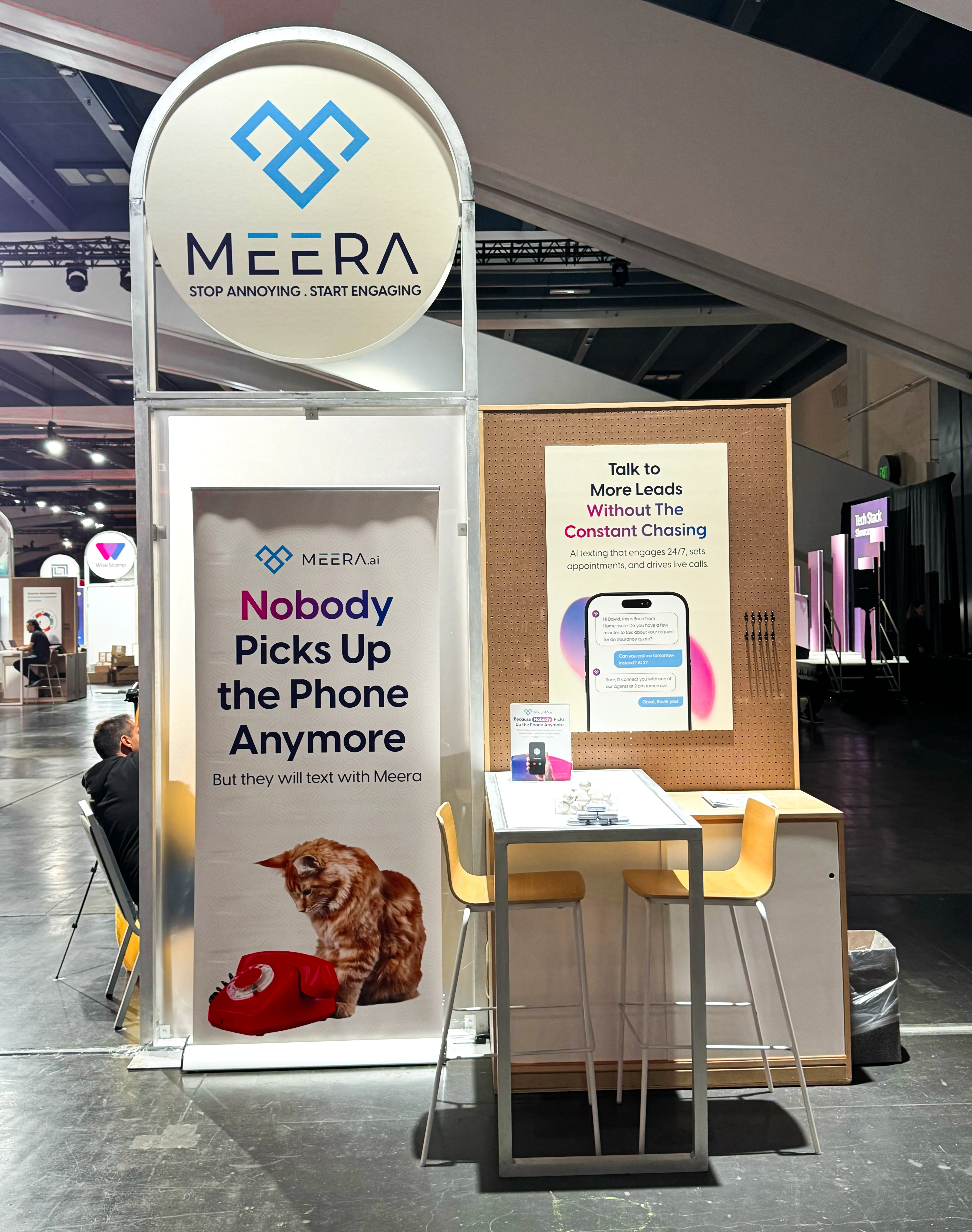
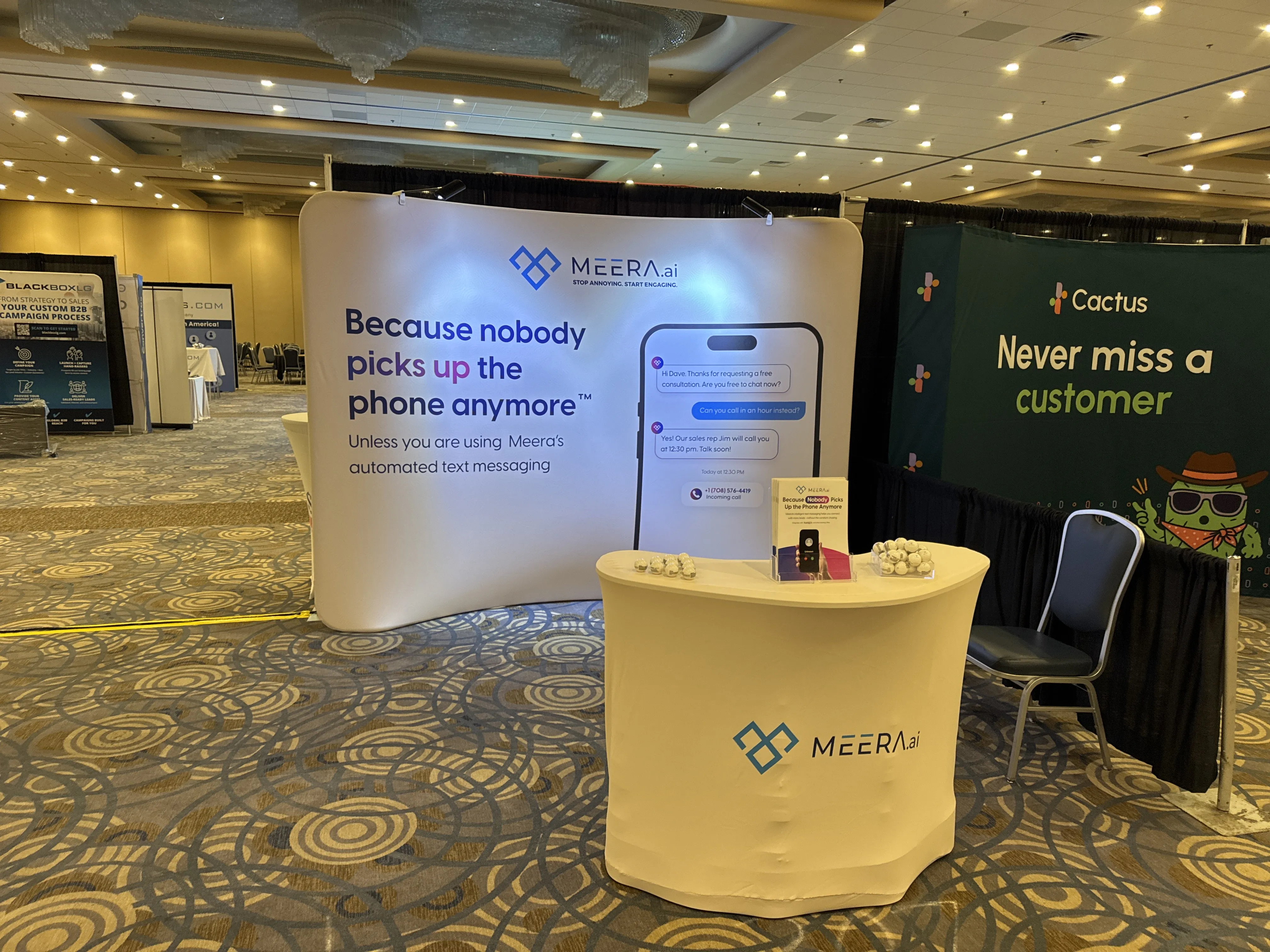
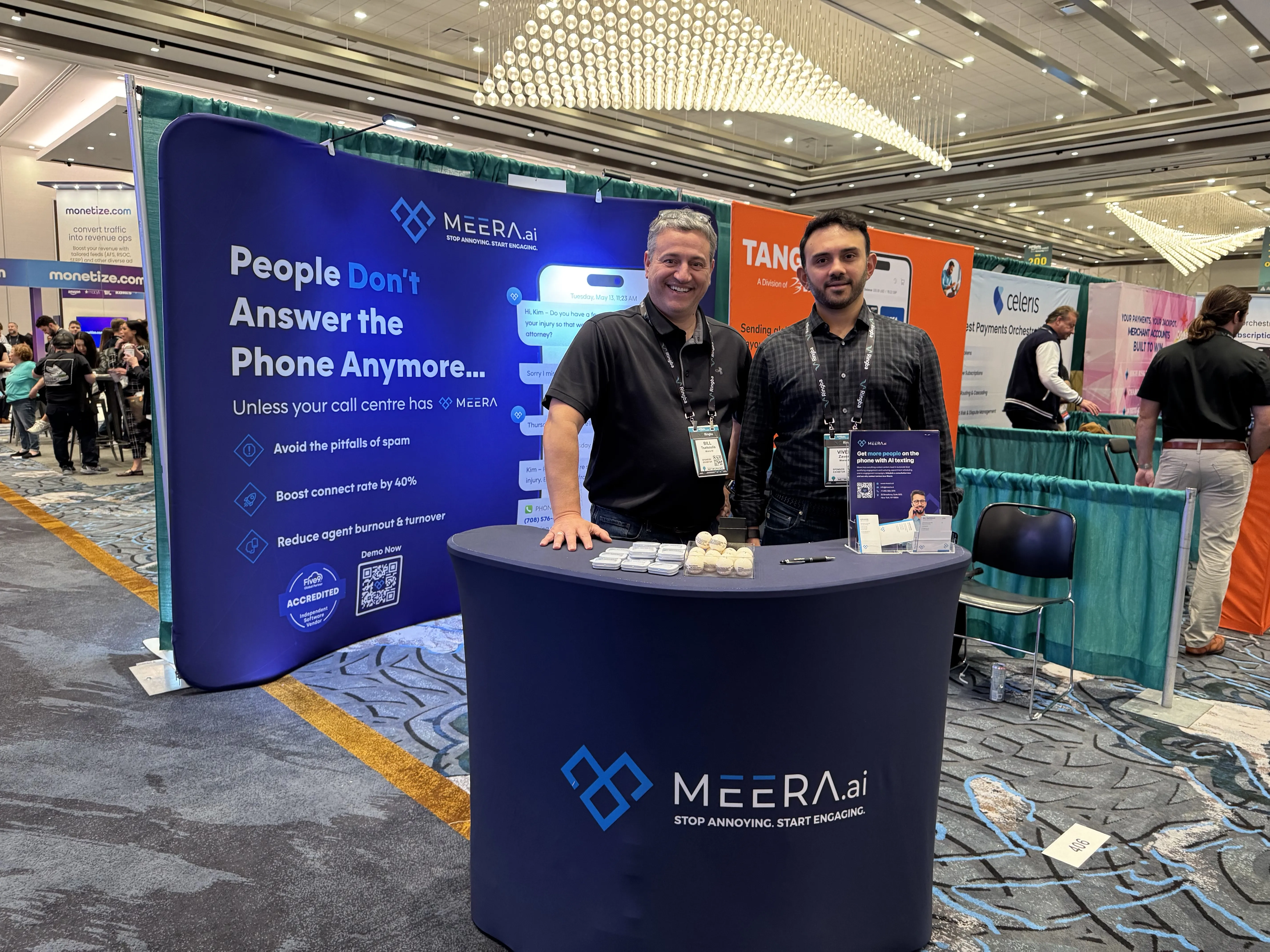
EXAMPLE 02 — THE BOOTH
Every booth designed to stop foot traffic, start conversations, and give the sales team something to be proud of standing behind. From tabletop displays to full island builds — consistent, premium, impossible to walk past.


Two touchpoints from a four-year engagement that spanned ads, explainer videos, social media, brochures, sales collateral, motion graphics, and more.
WHY IT WORKED
13x growth doesn't happen by accident. Every piece followed the same three principles.
Beautiful isn't enough. We track where people look, when they click, what makes them convert, and what makes them bounce. Every layout decision is a business decision. Every visual choice drives revenue.
Result: Design becomes your highest-ROI investment - not a cost center.
Buyers decide in seconds, not minutes. Your brand needs to communicate quality, credibility, and value before they finish scrolling. We design for that first impression - the one that determines if they read more or move on.
Result: More meetings. Shorter sales cycles. Higher close rates.
Every touchpoint tells the same story. Booth. Website. Email. Ad. Brochure. When everything looks, feels, and sounds like you, buyers remember you, trust you, choose you.
Result: Brand recognition that turns strangers into warm leads.
THE RESULTS
Time on site tripled. Bounce rates dropped across every major traffic source. The site stopped leaking attention and started holding it.
As the design matured, every channel it touched performed better - paid campaigns converted cleaner, organic traffic landed on pages built to answer the right questions, and referral visitors arrived already half-convinced.
13x revenue growth. A growth system that compounded.
The result wasn't just a better-looking website. It was a growth system that compounded over four years across every channel and touchpoint.
Most founders fix their product, their pricing, their sales process - and leave the website as an afterthought. This client didn't. They treated design as infrastructure, and it paid off at every stage of growth.
If your site isn't pulling its weight, that's not a design problem. It's a revenue problem.
Turn it into a growth asset - not a digital brochure.