Your website conducts silent dialogues that you remain unaware of
Your SaaS website will engage with potential customers at 2 AM when they browse it with their coffee-stained laptop during their desperate search for business solutions. The first few seconds of website interaction form an unspoken dialogue between your website and potential customers. Your website communicates two possible messages to visitors, through which it either offers understanding with help for their stressful needs or creates confusion for them to solve by themselves.
Most SaaS websites fail in their initial communication with website visitors because of their poor performance. Websites with good conversion rates typically reach 15% or higher success, while average websites achieve 2-5% conversion rates. The ability to grasp human online behavior leads to understanding what truly drives conversion success.
Your potential customers are human beings who function as actual decision makers who analyze more than just features. People in your target audience function as living beings who need to meet their deadlines under pressure from their bosses while managing their budgets. The following discussion explains how websites should connect with their human users.
The 3-Second Truth Bomb
You know that feeling when you walk into a store and immediately know whether you belong there? Your website creates that same gut reaction in about 3 seconds. The initial 3 seconds after entering your site determine whether visitors will understand if the content pertains to their needs.
When potential customers feel either lost or overwhelmed, they will exit immediately without return. Your website visitors disappear completely since they leave without looking back.
Websites that achieve success recognize an essential psychological principle that human brains naturally prefer easy information. The human mind operates with a built-in tendency to conserve energy, so it seeks out comfortable, familiar things. People tend to avoid situations that require excessive thinking because they fail to react.
The Secret Psychology Behind Clicks
The research by Stanford professor BJ Fogg exposed a fundamental principle about human conduct. People require three essential elements to perform an action (like software signup) at the exact same moment:
They need to want it (motivation) It needs to be easy (ability) Something needs to nudge them (trigger)
Consider the previous online subscription process you experienced. The solution attracted you because it was needed, while the signup process remained straightforward, and prominent buttons indicated the next steps. People will not convert when any single element from these three categories is missing.
The most effective SaaS websites achieve success by executing all three key elements:
The solution requires an obvious explanation of what users need it for
The sign-up process should be extremely simple for users
The ideal call-to-action button must be placed in the location where users naturally look
Why Social Proof is Your Secret Weapon

Research shows that 72% of people increase their trust in a product when they see other customers using it. People follow social behavior because they use others to determine what actions are both safe and intelligent.
Most companies fail to deliver proper social proof because they merely add logos to their homepage. Websites that deliver high conversion rates take their approach to a deeper level:
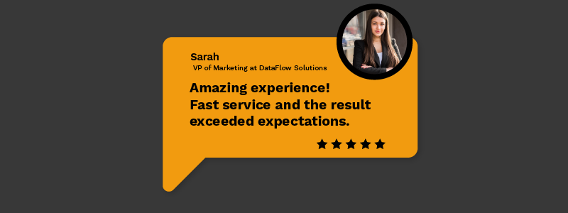
The website displays particular achievements, such as "Sarah's team saved 15 hours per week."
The platform displays concrete statistics, which state that "Join 50,000+ marketing teams"
The website presents genuine narratives through case studies that show transformational scenarios
The website showcases official recognition through industry awards and certifications
The difference between "people like us" statements and actual proof of "people like you achieving real results" exists.
Your Homepage Hero Section: The Make-or-Break Moment
The hero section of your homepage functions as the first line of a conversation, which establishes either an immediate connection or complete disinterest with visitors. The initial content either draws users in or immediately drives them away from the website.
What Actually Works
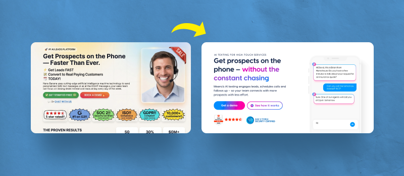
Skip the clever taglines. The traditional approach of using clever taglines should be avoided. The effective approach uses "Stop wasting 3 hours a day on manual reports" instead of "Revolutionizing the future of productivity." People do not have an interest in revolutions because they want their time back rather than revolutionizing anything.
Show, don't just tell. Software demonstrations through images and videos help visitors see your software in operation. Visual information reaches our brains at 60,000 times faster than textual information.
Make your button impossible to miss. Make your call to action stand out by combining contrasting colors with relatable language. People prefer "Start My Free Trial" to "Start Free Trial" since this version provides a more human touch.
The Art of Not Overwhelming People
The experience of entering a restaurant filled with a lengthy menu that results in total decision paralysis is familiar to most people. Visitors become overwhelmed when SaaS websites display their entire feature set at once.
Companies achieve their best results by implementing "progressive disclosure," which delivers information in manageable segments:
Start with the big picture: The first step begins with presenting the main issue that your solution addresses Then add details: How do you solve it? Finally, get specific: The last step involves providing specific information about what people can expect
The onion-peeling process follows a positive direction. The process shows details to users who need more information while keeping essential information visible for those who require minimal content.
Colors and Fonts That Actually Matter

The way our brains respond to colors remains a fascinating fact because various hues activate distinct emotional reactions.
Color Psychology
Blue
- The business software sector should utilize blue because it establishes trust with users
Green
- The color combination of green creates a positive signal that also indicates progress (ideal for signup buttons)
Orange and red
- The colors orange and red work best for creating urgency in specific situations
Purple
- The innovative nature of purple makes it suitable for creative tools
Font Selection
Keep your website font selection basic because it should be straightforward. Your website should not function as a testing ground for your favorite script font. Website visitors need fast and easy reading capabilities since most users access websites through their phones.
Mobile Optimization
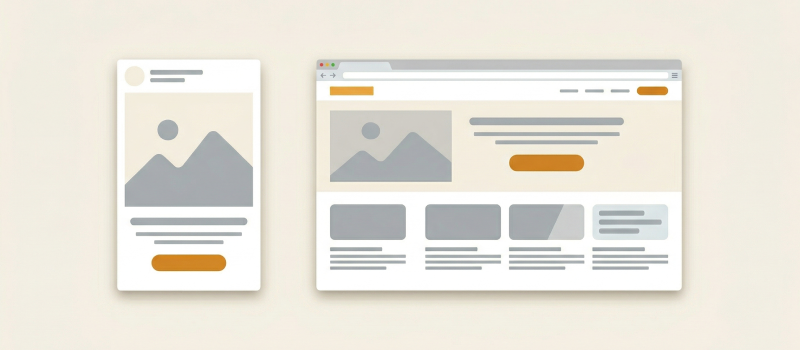
Most potential customers access your website through mobile devices because mobile users account for 68% of your target audience. Your website looks broken on mobile devices, which means you essentially force 7 out of 10 users to leave your site.
The Psychology of Your Pricing Page
Your pricing page stands as the essential page that controls the entire visitor experience on your website. The pricing page serves as the decisive point that turns visitor interest into either conversion or abandonment.
The professionals understand that people dislike performing mathematical calculations. Users need fast answers about which option suits them best. The best pricing pages use psychological tricks that feel helpful, not manipulative:
Effective Pricing Strategies
The middle option trick: Make your preferred plan the middle one. People naturally avoid extremes.
Highlight what's popular: A "Most popular" badge provides social evidence which helps users decide faster.
Focus on outcomes, not features: The best approach is to present outcome benefits instead of product features by using "Store everything your team needs" instead of "50GB storage."
Making Testing Your Superpower
Your website performance data remains a mystery because no one truly knows which elements produce the best results. None of us does. The assumptions we hold prove incorrect more frequently than we care to recognize.
The companies with the highest-converting websites run ongoing tests as their secret to success. Businesses run tests to evaluate either two distinct headlines or button placement modifications to observe user responses. The implementation of minor changes leads to a 30% increase or higher in conversion rates.
The essential factor involves testing one factor at a time while extending tests for a minimum period of two weeks to acquire genuine results.
What's Coming Next: The Future of SaaS Websites
The most intriguing development in modern web design involves websites that customize their content according to individual visitors. Your homepage should transform according to visitor status between new and existing prospects as well as display industry-specific content.
AI and Personalization
AI technology enables these capabilities and its implementation has shifted from theoretical to real-time implementation. Websites that implement personalized experiences achieve remarkable increases in their conversion rates.
Emerging Technologies
More websites are being built with voice control features and enhanced accessibility features included. Companies that respond to technological changes in website interaction will obtain significant market advantages.
Your Step-by-Step Action Plan
Feeling overwhelmed? Don't be. You don't have to fix everything at once. Here's how to prioritize:
Week 1-2: The Foundation
Examine your website through the perspective of someone who has never viewed it before (or obtain feedback from such an individual)
Measure the duration needed to comprehend your business operations
Check how it looks on a phone
Week 3-6: The Big Fixes
Make your headline about delivering benefits instead of describing features
Simplify your navigation
Your main call-to-action button should be impossible for visitors to overlook
Your website should have a fast loading speed when viewed from mobile devices
Week 7-10: The Smart Stuff
You should implement customer testimonial sections that demonstrate particular achievements
Create an interactive demo or trial experience
Set up basic analytics to track what's working
Ongoing: The Growth
Test a single minor change every month as your standard procedure
The website should function as a tool for genuine customer communication by asking about their confusion
Monitor the activities of your successful competitors to understand what they are doing
The Bottom Line: People First, Technology Second
The core principle of SaaS website excellence relies on having designers who grasp the everyday challenges their customers encounter.
The website avoids trying to create an impression through fancy graphics as well as technical jargon. The site features authentic dialogues with authentic people who face authentic challenges that need solutions.
At 2 AM, when someone stressed about their deadline, visits your website, it should communicate the same comforting message as a helpful friend who provides step-by-step assistance.
Design that genuinely connects with users leads to business success. People who feel understood after visiting your website will not only convert but also become loyal customers who recommend your services to others.
The Final Truth
Each website click originates from someone who wants to enhance their professional tasks. Create your design for the needs of your users rather than seeking awards or personal preferences. Your conversion rates (and your bank account) will thank you.
The fundamental human need for understanding and assistance remains unchanged despite technological advancements. The rest of your design work will automatically align when you master this fundamental principle.


