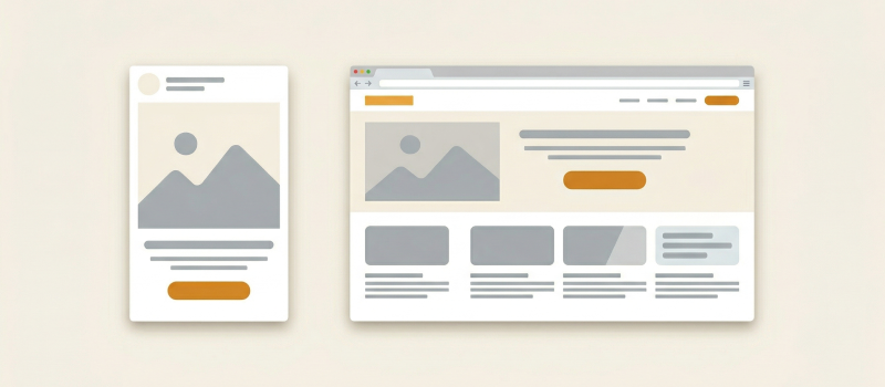
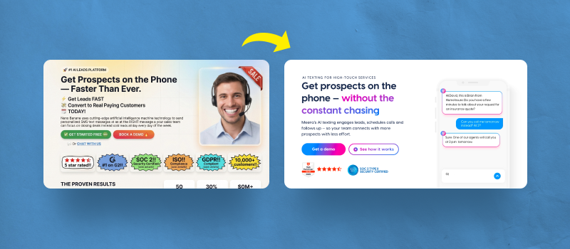
When designing digital experiences, intuition and aesthetics only go so far. The most successful interfaces are built on principles deeply rooted in human psychology. This is where UX design laws come in — guiding rules that help designers anticipate user behavior, reduce friction, and create more intuitive and engaging experiences.
Here’s a look at the most important UX design laws every designer should know and apply.
1. Hick’s Law: Simplify Decision Making
Principle: The time it takes to make a decision increases with the number and complexity of choices.
Application in UX:
Reduce the number of options in navigation menus.
Use progressive disclosure to avoid overwhelming users.
Group similar tasks or functions together.
Example: When you visit a website with a simple navigation bar (Home, About, Services, Contact), it’s easier to choose your next step than when confronted with 20 links.
2. Fitts’s Law: Target Size and Distance Matter
Principle: The time to acquire a target is a function of the distance to and size of the target.
Application in UX:
Make buttons large enough to be easily clickable.
Place commonly used controls within easy reach (especially in mobile apps).
Avoid small tap targets placed in hard-to-reach corners.
Example: Touch targets on mobile should be at least 44px wide to ensure ease of use.
3. Jakob’s Law: Users Prefer Familiarity
Principle: Users spend most of their time on other websites. They prefer your site to work the same way as all the others they already know.
Application in UX:
Use conventional layouts (e.g., logo top-left, hamburger menu top-right).
Stick to standard iconography and patterns.
Prioritize usability over originality.
Example: An e-commerce checkout process that mirrors Amazon’s flow will feel intuitive because users have already internalized it.
4. Law of Proximity: Group Related Elements
Principle: Objects that are near each other are perceived as related.
Application in UX:
Group labels close to form fields.
Ensure spacing conveys hierarchy and relationships.
Use whitespace effectively to define structure.
Example: In a signup form, placing the password label directly above the input field strengthens the visual association.
5. Miller’s Law: Limit Cognitive Load
Principle: The average person can only keep 7 (plus or minus 2) items in their working memory.
Application in UX:
Break content into smaller chunks (e.g., steps, cards, accordions).
Use short lists and concise copy.
Avoid overloading interfaces with too much information at once.
Example: Netflix categorizes content into sections like “Top Picks,” “Trending,” and “New Releases” rather than showing everything on one screen.
6. Parkinson’s Law: Set Time Constraints
Principle: Work expands to fill the time available for its completion.
Application in UX:
Use timers or progress bars in workflows.
Encourage task completion by clearly indicating the time involved.
Prevent procrastination with visual feedback.
Example: Duolingo uses time-based challenges and daily streaks to motivate learning in small, manageable chunks.
7. Law of Prägnanz (Simplicity): Favor Simple Designs
Principle: People perceive ambiguous or complex images in the simplest form possible.
Application in UX:
Use clear visual hierarchies.
Avoid visual clutter and unnecessary embellishments.
Design with clarity and minimalism in mind.
Example: Google’s homepage is a masterclass in simplicity — just a logo and a search bar, with no distractions.
8. Tesler’s Law (Law of Conservation of Complexity)
Principle: Every application has an inherent amount of irreducible complexity. You can’t eliminate it, but you can shift it.
Application in UX:
Designers should handle complexity, not users.
Automate repetitive or complex tasks.
Provide smart defaults and helpful wizards.
Example: TurboTax handles complex tax forms with a simple Q&A interface for users.
9. Doherty Threshold: Speed Enhances Satisfaction
Principle: Productivity soars when a computer and its users interact at a pace (<400ms) that ensures neither has to wait on the other.
Application in UX:
Optimize loading speed.
Provide immediate feedback for user actions (e.g., animations, loaders).
Keep system response times fast and consistent.
Example: Instagram’s quick double-tap like response feels instant, encouraging repeated use.
10. Aesthetic-Usability Effect
Principle: Users are more tolerant of usability issues when a design is aesthetically pleasing.
Application in UX:
Prioritize visual design, even when optimizing functionality.
Ensure consistency in fonts, colors, and layout.
Use imagery and animation to enhance perception.
Example: Apple products are known for their clean, attractive interfaces — which users perceive as more usable even when functionality is similar to competitors.
Conclusion: Design with Psychology in Mind
Great UX is not just about beauty or innovation — it’s about understanding how users think, behave, and make decisions. By grounding your designs in these foundational laws of UX, you can build experiences that are not only elegant but deeply intuitive.
Whether you’re designing your next website, app, or digital product, these laws provide a powerful framework to guide your decisions. Learn them, apply them, and watch your user satisfaction soar.


