
A founder once sent me his landing page and said: "We've rewritten the copy three times. Hired two different copywriters. Traffic is decent but conversions are terrible. What are we missing?"
I opened the page.
The copy was actually fine. Clear headline, decent value prop, logical flow. Nothing wrong with the words.
But I immediately spotted four other things that were quietly killing his conversions - none of them had anything to do with copy.
This is more common than you'd think. Founders obsess over the words on their landing page while the real leaks are hiding in plain sight elsewhere.
Here's what's actually breaking your SaaS landing page.
First, the numbers you need to know
The median conversion rate for SaaS landing pages sits at around 3.8%. Top performers hit 10% and above.
If you're below 2%, something structural is broken - not just your headline.
And here's the stat that should make every SaaS founder uncomfortable: every single second of page load time costs you 7% in conversions. Not 0.7%. Seven.
Keep that in mind as you read through this.
Mistake 1 - You're Talking to Everyone, Converting No One
Go back to your landing page right now and ask: who exactly is this written for?
If the honest answer is "anyone who might need this" - that's your problem.
Landing pages that try to speak to enterprise buyers and solo founders in the same breath end up resonating with neither. You end up with a page full of features, vague benefits, and a headline that sounds like it could belong to literally any SaaS product.
"Streamline your workflow." "Work smarter, not harder." "The all-in-one platform for teams."
Sound familiar?
These headlines don't convert because they don't make anyone feel like the page was built for them specifically.
The fix is uncomfortable but simple: pick one person, one problem, one outcome. Write the entire page for that person. Everyone else is a bonus.
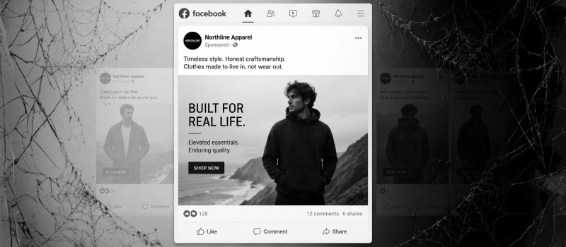
Mistake 2 - Your Hero Section Is Doing Too Much
You have about 5 seconds before a visitor decides whether to keep reading or bounce.
In those 5 seconds, they're asking three questions:
What is this?
Is this for me?
What do I do next?
Most SaaS hero sections fail to answer all three clearly. They lead with a product screenshot that means nothing to someone who's never used the product. Or a vague tagline followed by three paragraphs of context-setting.
By the time you've explained what the product does, they're gone.
The best performing hero sections I've seen - and worked on - answer all three questions in under 10 words of headline, a single supporting sentence, and one obvious CTA button. That's it.
Everything else is below the fold.
Mistake 3 - One Page, Multiple CTAs Pointing Everywhere
This one kills me every time I see it.
"Start Free Trial" at the top. "Book a Demo" in the middle. "Watch Video" further down. "Learn More" in three different sections. "Contact Us" in the footer.
Every additional CTA you add splits your visitor's attention and reduces the chance they'll take any action at all.
Your landing page should have one primary goal. One. Everything else is a distraction.
If you need to offer both a free trial and a demo, fine - but one of those should clearly be primary, and the other should be secondary in size, color, and placement. Never equal.
Mistake 4 - You're Ignoring the 83% of Visitors on Mobile
Here's a stat that's hard to ignore: 83% of web traffic now comes from mobile devices.
And yet the vast majority of SaaS landing pages are still designed desktop-first, then squeezed down for mobile as an afterthought. The result is oversized images that take forever to load, form fields that are impossible to tap accurately, and hero sections where the headline gets cut off mid-sentence.
Mobile visitors already convert 8% lower than desktop visitors even on well-optimized pages. A poorly optimized mobile page can make that gap far worse.
Design mobile first. Then scale up to desktop - not the other way around.
Mistake 5 - Your Social Proof Is Weak (Or Placed Wrong)
Most SaaS landing pages have testimonials. Almost none of them use them effectively.
Generic quotes like "Great product, highly recommend!" with a first name and a stock photo do nothing for conversion. Visitors don't trust them. They look fake even when they're real.
Strong social proof is specific. It names the outcome, not just the experience.
"We cut our onboarding time by 40% in the first month" from a named person at a named company - that converts. "Love this tool!" from @Sarah_M - that doesn't.
Placement matters too. Put your strongest testimonial right next to your primary CTA, not buried at the bottom of the page where no one scrolls.
Mistake 6 - Your Page Loads Slowly and You Don't Know It
Go to PageSpeed Insights right now. Enter your landing page URL. Look at your mobile score.
If it's below 70, you have a serious problem that no amount of copywriting will fix.
Slow pages bleed visitors before they even read a single word. And because this happens silently - no error message, no obvious symptom - most founders have no idea it's happening.
Common culprits: uncompressed images, too many third-party scripts, heavy animation libraries loaded on the first paint. None of these are hard to fix once you know they're there.
The Real Reason Conversions Are Low
Here's the honest takeaway from four years of working on SaaS marketing and design:
Most landing page problems aren't copywriting problems. They're clarity problems.
Clarity about who the page is for. Clarity about what action you want them to take. Clarity about why they should trust you enough to take that action right now.
When those three things are tight, everything else - copy, design, layout - falls into place much more easily.
Rewriting your headline for the fourth time won't fix a broken mobile experience or a page that loads in 6 seconds.
Fix the structure first. Then optimize the words.
Quick Audit Checklist
Run through this before you touch the copy:
Does your hero section answer "what is this, for who, and what do I do next" in under 5 seconds?
Do you have one primary CTA that clearly dominates the page?
Is your mobile experience designed intentionally, not just scaled down?
Is your strongest social proof sitting next to your main CTA?
Does your PageSpeed mobile score hit 70 or above?
Is the page written for one specific type of customer, not everyone?
If you answered no to two or more of these, you've found your conversion problem. It was never the copy.
Pash is a designer and creative director who's spent four years driving growth through design and marketing at Meera.ai. He works with SaaS founders and startups at heypash.com. Want a quick audit of your landing page? Reach out here.