
At a glance:
A good-looking website and a high-converting website are not the same thing. Most redesigns optimise for the wrong one.
Designers (myself included) default to aesthetics when the brief doesn't force business outcomes into the conversation.
The five most common conversion killers look like good design decisions on the surface: generous whitespace, scroll-dependent CTAs, brand-film homepages, clever copy, and hidden friction.
A redesign that improves conversion 20-200% is possible. But only if the designer is solving for clarity, not applause.
Your site looks great. People tell you that. Your designer's portfolio got a nice addition. Maybe you even won a little award.
But your trial signups are flat. Your bounce rate didn't move. Your contact form submissions actually went down.
So you blame the copy. Or the traffic. Or the market.
Here's the uncomfortable part: the design might be the problem. And I say that as someone who has been the designer in this exact situation.
The redesign trap
Most redesigns start with the wrong question. "How should this look?" instead of "What should this do?"
When a founder comes to a designer and says "we need a new website," the designer hears a creative brief. They pull references from Awwwards. They explore typography pairings. They build something that feels premium.
Nobody in the room asks: what is the one thing a visitor needs to do on this page, and what's stopping them from doing it right now?
That's how you end up with a website that collects compliments from other designers and confused clicks from actual customers.
A 2026 study of 340+ business websites found that most companies spend thousands on redesigns that generate zero measurable ROI. Not because the design was ugly. Because it was optimised for the wrong outcome.
The five mistakes that look like good design
1. Whitespace worship
Whitespace is a tool. It creates breathing room, directs attention, separates ideas. Every design school teaches this.
What they don't teach is when whitespace becomes a conversion killer.
When your CTA sits 800 pixels below the fold because the hero section needs to "breathe," you've traded clarity for atmosphere. When there's so much space between your headline and your value proposition that they stop feeling connected, you've created a magazine spread, not a sales page.
The fix isn't cramming everything above the fold. It's using whitespace to guide attention toward the action, not away from it.
2. The scroll-dependent CTA
This one is everywhere. The primary call to action lives at the bottom of the page. Or worse, it only appears once, halfway through a long scroll.
The designer's logic: "We need to build the narrative first. Earn the click."
The data's logic: most visitors never get there. Average scroll depth on a landing page is around 50-60%. If your only CTA lives at the bottom, half your visitors never see it.
A CTA should appear when the visitor is ready to act, not when the page is ready to ask. That means it shows up early, repeats with context, and stays accessible throughout the scroll. Not aggressively. Just present.
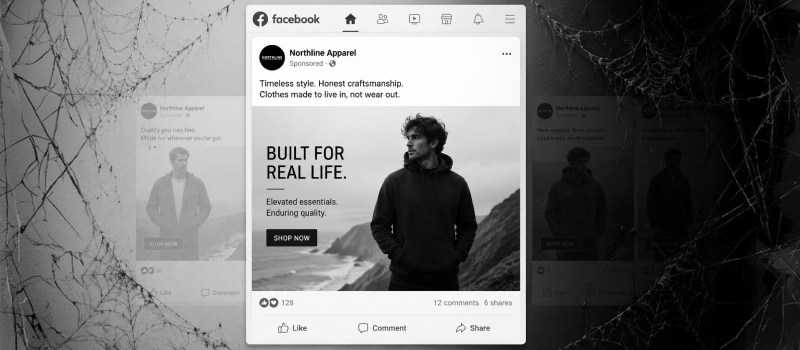
3. The brand-film homepage
You land on the site. There's a cinematic hero video. A vague tagline. Something about "transforming the future of [industry]." You scroll. There's a mission statement. Then some abstract iconography. Then, finally, buried three scrolls deep: what the company actually does.
This is the brand-film homepage. It prioritises mood over message. It makes the company feel important but doesn't tell the visitor why they should care.
Founders love it because it feels premium. Designers love it because it's fun to build. Visitors leave because after 10 seconds they still don't know what you sell.
Your homepage has one job: tell people what you do, who it's for, and what to do next. If a first-time visitor can't answer all three within five seconds, the design failed. Regardless of how good it looks.
4. Clever copy over clear copy
This is a shared sin between designers and copywriters. The headline that's a pun. The button that says "Let's Go" instead of "Start Free Trial." The navigation labels that are creative instead of obvious.
Clever copy makes the team smile during the review meeting. Clear copy makes the customer convert.
Every time you choose a word that sounds better over a word that communicates faster, you're adding a microsecond of cognitive load. One instance doesn't matter. Across an entire page, it adds up to confusion. Confusion kills conversion.
The rule is simple: if someone needs context to understand your button label, rewrite it.
5. Hidden friction in the flow
This is the subtlest one. The design looks clean. The layout makes sense. But somewhere in the flow, there's a step that creates just enough hesitation to kill momentum.
A pricing page that requires a click to reveal prices. A signup form that asks for a phone number with no explanation. A "Book a Demo" button that leads to a 15-field form. A modal that interrupts the scroll with a newsletter popup before the visitor knows what you do.
Each of these feels minor in isolation. Together, they create a death-by-a-thousand-cuts experience. The visitor doesn't consciously decide to leave. They just... don't continue.
Good conversion design isn't about adding persuasion. It's about removing hesitation.
Why designers keep making these mistakes
This isn't about bad designers. It's about misaligned incentives.
Designers are trained to create beautiful, award-worthy work. Their portfolios reward visual impact. Their peers validate aesthetics. When they get hired, the brief usually reinforces this: "We want something modern, clean, premium."
Nobody says "we want something that increases demo requests by 30%." And even when they do, the feedback loop is broken. The designer ships the site, the client says it looks great, the invoice gets paid. Three months later, when conversion data tells a different story, the designer is long gone.
The designers who build sites that actually convert aren't necessarily more talented. They just ask different questions before they start designing:
What's the one action this page needs to drive?
Where do visitors currently drop off?
What objections does a visitor have at each scroll point?
What's the simplest version of this page that could work?
If your designer isn't asking these questions, you'll get a beautiful website. You just might not get a useful one.
What to do if this is your site right now
You don't need another redesign. You need a focused audit.
Look at your homepage with fresh eyes. Can a stranger tell what you do, who it's for, and what to do next within five seconds? If not, that's problem one.
Check your scroll depth data against your CTA placement. If your primary CTA sits below the average fold, move it up. Not as a popup. As a natural part of the page flow.
Read every button label out loud. If any of them require context from the surrounding text to make sense, rewrite them to be self-explanatory.
Walk through your signup or contact flow as a new visitor. Count every field, every click, every decision point. Cut anything that doesn't directly serve the conversion.
These aren't big changes. They don't require a new design system or a rebrand. They require a designer who cares about what happens after someone lands on your page, not just how the page looks when they get there.
The real job of a website
A website is not a portfolio piece. It's not a brand statement. It's a machine that takes strangers and turns them into customers, subscribers, or leads.
Good design makes that machine work smoothly. Great design makes it invisible. The visitor doesn't notice the typography or the grid. They just know what to do and feel confident doing it.
That's the redesign worth paying for.
If your current site looks great but isn't performing, it might be a design problem hiding behind a design solution. And the fix might be simpler than you think.
Want a second pair of eyes? I help founders figure out what their website is actually doing vs. what it should be doing. Say hi at heypash.com.